Evidence Gap Maps
mars authors
2026-05-15
Evidence-Gap-Maps.RmdThis vignette shows how to create base-R evidence gap maps with
gap_map_plot().
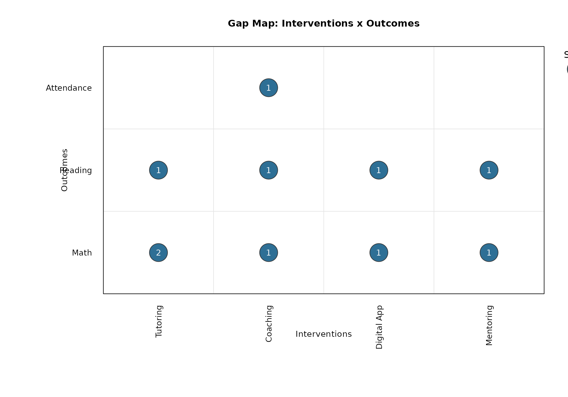
The default display uses:
- Outcomes on the y-axis
- Interventions on the x-axis
- Bubble size for number of studies
- Bubble label for number of effect sizes
library(mars)Long-Format Input
A common format is one row per effect size.
gap_long <- data.frame(
  study = c("S1", "S1", "S2", "S3", "S3", "S4", "S5", "S6", "S7", "S7"),
  effect = c("E1", "E2", "E3", "E4", "E5", "E6", "E7", "E8", "E9", "E10"),
  intervention = c(
    "Tutoring", "Tutoring", "Tutoring", "Coaching", "Coaching",
    "Digital App", "Digital App", "Coaching", "Mentoring", "Mentoring"
  ),
  outcome = c(
    "Math", "Math", "Reading", "Math", "Reading",
    "Reading", "Math", "Attendance", "Math", "Reading"
  ),
  stringsAsFactors = FALSE
)

gap_long
#>    study effect intervention    outcome
#> 1     S1     E1     Tutoring       Math
#> 2     S1     E2     Tutoring       Math
#> 3     S2     E3     Tutoring    Reading
#> 4     S3     E4     Coaching       Math
#> 5     S3     E5     Coaching    Reading
#> 6     S4     E6  Digital App    Reading
#> 7     S5     E7  Digital App       Math
#> 8     S6     E8     Coaching Attendance
#> 9     S7     E9    Mentoring       Math
#> 10    S7    E10    Mentoring    Reading
Default Gap Map
out_default <- gap_map_plot(
  data = gap_long,
  intervention = "intervention",
  outcome = "outcome",
  study_id = "study",
  effect_id = "effect",
  main = "Gap Map: Interventions x Outcomes"
)
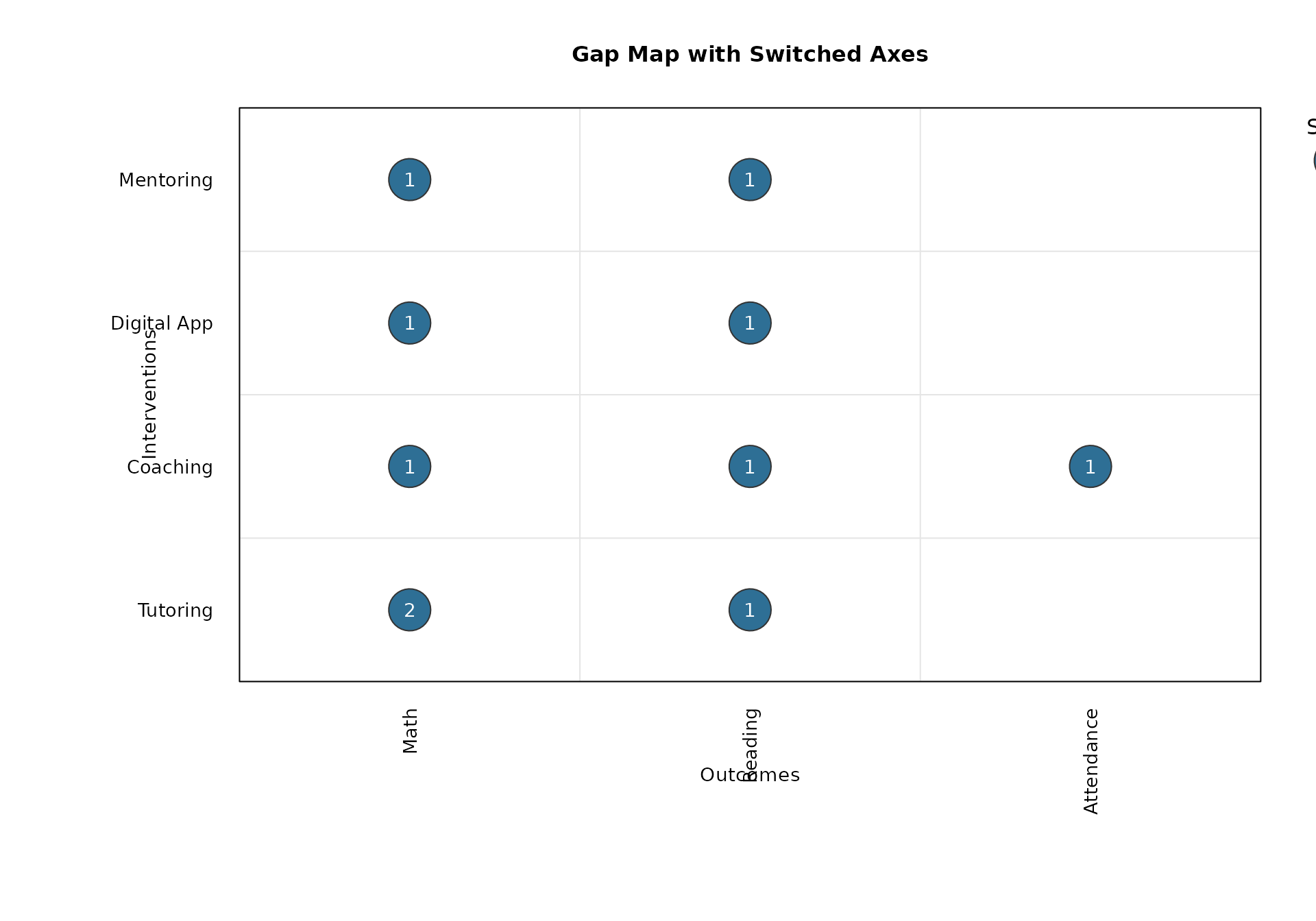
Switch Axes
Use switch_axes = TRUE to put outcomes on x and
interventions on y.
gap_map_plot(
  data = gap_long,
  intervention = "intervention",
  outcome = "outcome",
  study_id = "study",
  effect_id = "effect",
  switch_axes = TRUE,
  main = "Gap Map with Switched Axes"
)
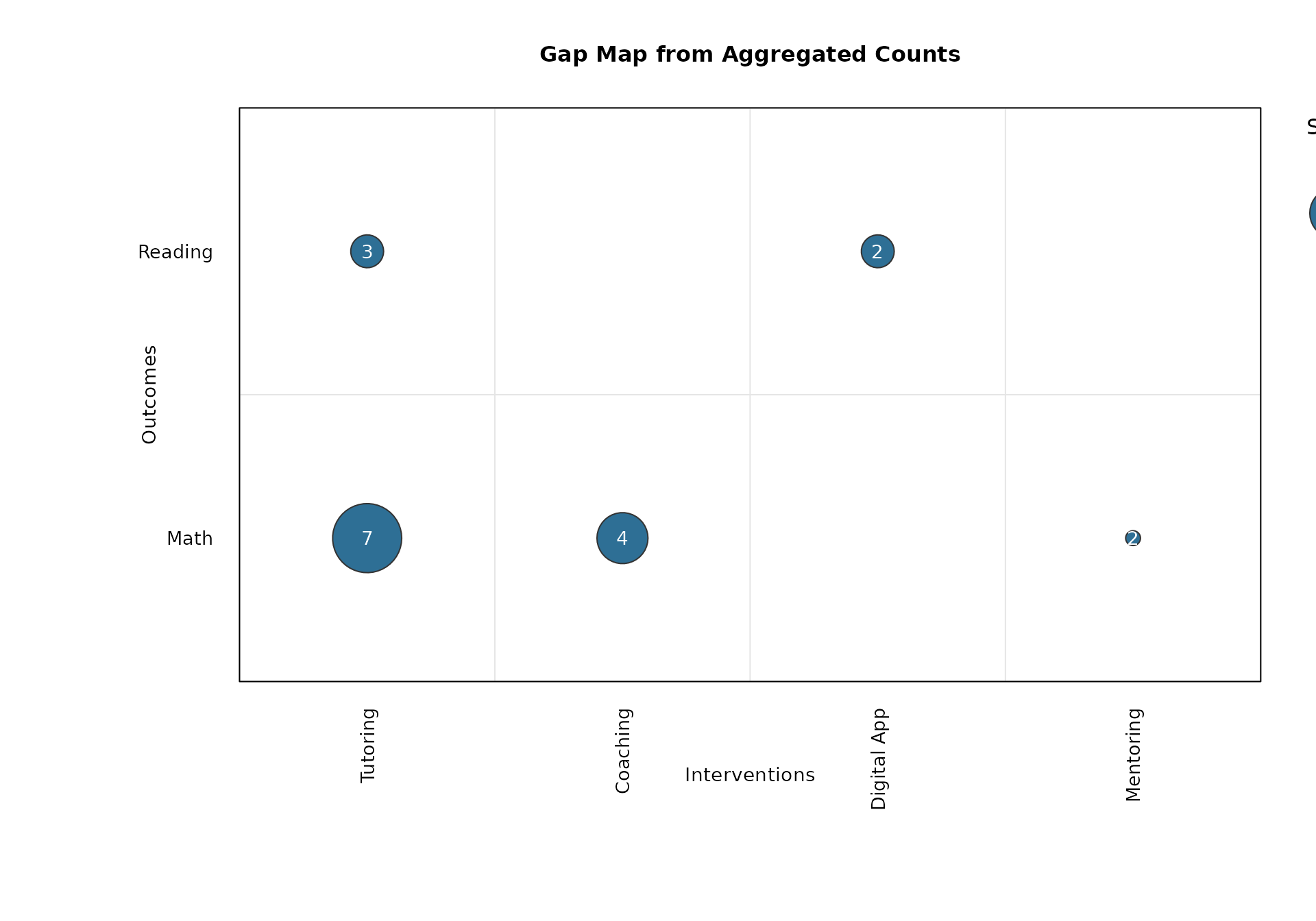
Aggregated Input
You can also provide pre-aggregated counts for studies and effect sizes.
gap_agg <- data.frame(
  intervention = c("Tutoring", "Tutoring", "Coaching", "Digital App", "Mentoring"),
  outcome = c("Math", "Reading", "Math", "Reading", "Math"),
  n_studies = c(4, 2, 3, 2, 1),
  n_effects = c(7, 3, 4, 2, 2),
  stringsAsFactors = FALSE
)

gap_agg
#>   intervention outcome n_studies n_effects
#> 1     Tutoring    Math         4         7
#> 2     Tutoring Reading         2         3
#> 3     Coaching    Math         3         4
#> 4  Digital App Reading         2         2
#> 5    Mentoring    Math         1         2
out_agg <- gap_map_plot(
  data = gap_agg,
  intervention = "intervention",
  outcome = "outcome",
  n_studies = "n_studies",
  n_effects = "n_effects",
  main = "Gap Map from Aggregated Counts"
)
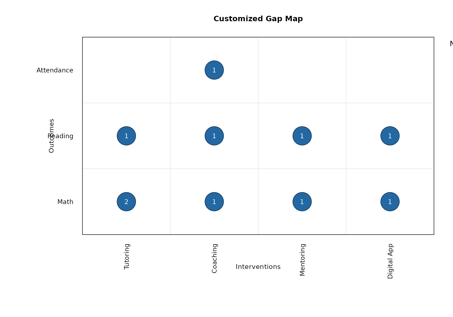
Customization
You can control ordering, colors, bubble scaling, and legends.
gap_map_plot(
  data = gap_long,
  intervention = "intervention",
  outcome = "outcome",
  study_id = "study",
  effect_id = "effect",
  intervention_order = c("Tutoring", "Coaching", "Mentoring", "Digital App"),
  outcome_order = c("Math", "Reading", "Attendance"),
  bubble_range = c(2, 9),
  bubble_col = "#2368A2",
  bubble_border = "#0F2D4A",
  text_col = "white",
  size_legend_values = c(1, 2, 4),
  size_legend_title = "Number of Studies",
  main = "Customized Gap Map"
)
Returned Values
The function returns the aggregated plotting table invisibly.
names(out_default)
#> [1] "data"     "x_levels" "y_levels"
out_default$data
#>   intervention    outcome n_studies n_effects
#> 1     Coaching Attendance         1         1
#> 2     Coaching       Math         1         1
#> 6     Coaching    Reading         1         1
#> 3  Digital App       Math         1         1
#> 7  Digital App    Reading         1         1
#> 4    Mentoring       Math         1         1
#> 8    Mentoring    Reading         1         1
#> 5     Tutoring       Math         1         2
#> 9     Tutoring    Reading         1         1

names(out_agg)
#> [1] "data"     "x_levels" "y_levels"
out_agg$data
#>   intervention outcome n_studies n_effects
#> 1     Coaching    Math         3         4
#> 4  Digital App Reading         2         2
#> 2    Mentoring    Math         1         2
#> 3     Tutoring    Math         4         7
#> 5     Tutoring Reading         2         3