Risk of Bias Plots
mars authors
2026-05-15
Risk-of-Bias-Plots.RmdThis vignette shows how to create two base-R risk-of-bias displays
with risk_of_bias_plot():
- A study-level traffic-light panel
- A component-level stacked percentage bar panel (Low/Unclear/High, summing to 100)
library(mars)Required Input Structure
The function expects long-format data with one row
per study x component judgment:
-
study: study identifier -
component: risk-of-bias domain/component name -
decision: judgment (Low,Unclear,High)
Common case/spelling variants are accepted, including
low risk, high risk,
some concerns, and uncler.
rob_data <- data.frame(
study = rep(paste0("Study_", 1:6), each = 5),
component = rep(
c("Randomization", "Allocation Concealment", "Blinding", "Incomplete Data", "Reporting"),
times = 6
),
decision = c(
"Low", "Low", "Unclear", "High", "Low",
"Low", "Unclear", "Unclear", "High", "Low",
"High", "High", "Unclear", "Low", "Low",
"Low", "Low", "Low", "Low", "Low",
"Uncler", "Low", "High", "Unclear", "Low",
"Some concerns", "Low risk", "High risk", "Unclear", "Low"
),
stringsAsFactors = FALSE
)
head(rob_data, 10)
#> study component decision
#> 1 Study_1 Randomization Low
#> 2 Study_1 Allocation Concealment Low
#> 3 Study_1 Blinding Unclear
#> 4 Study_1 Incomplete Data High
#> 5 Study_1 Reporting Low
#> 6 Study_2 Randomization Low
#> 7 Study_2 Allocation Concealment Unclear
#> 8 Study_2 Blinding Unclear
#> 9 Study_2 Incomplete Data High
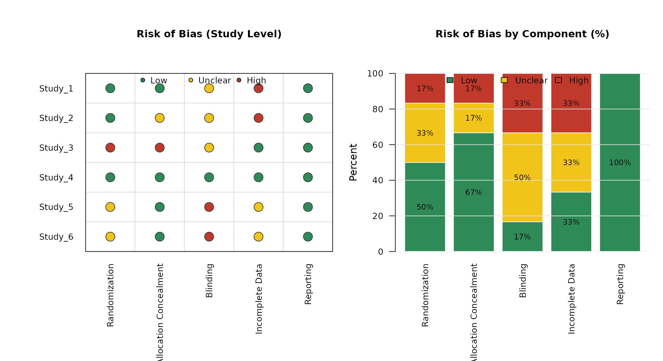
#> 10 Study_2 Reporting LowDefault Plot
out <- risk_of_bias_plot(
  data = rob_data,
  study = "study",
  component = "component",
  decision = "decision"
)
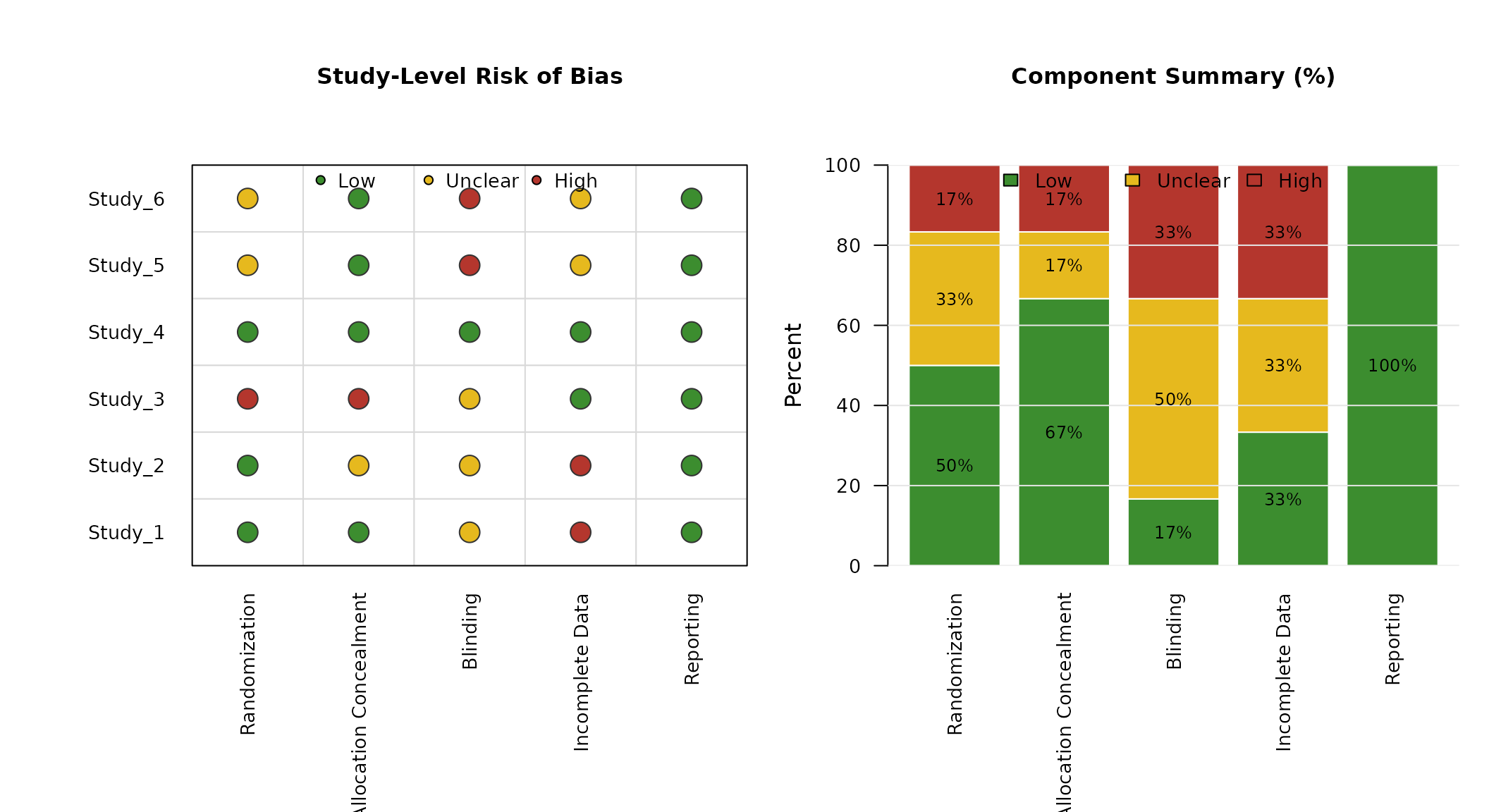
Custom Ordering and Colors
You can control row/column order and traffic-light colors.
risk_of_bias_plot(
  data = rob_data,
  study = "study",
  component = "component",
  decision = "decision",
  study_order = paste0("Study_", 6:1),
  component_order = c(
    "Randomization",
    "Allocation Concealment",
    "Blinding",
    "Incomplete Data",
    "Reporting"
  ),
  low_col = "#3C8D2F",
  unclear_col = "#E6B91E",
  high_col = "#B4362D",
  main_traffic = "Study-Level Risk of Bias",
  main_aggregate = "Component Summary (%)"
)
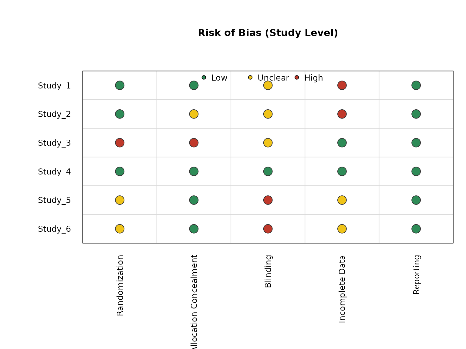
Separate Plots and Horizontal Aggregate Bars
You can request one panel at a time, and draw the aggregate panel horizontally.
risk_of_bias_plot(
  data = rob_data,
  study = "study",
  component = "component",
  decision = "decision",
  plot = "study"
)
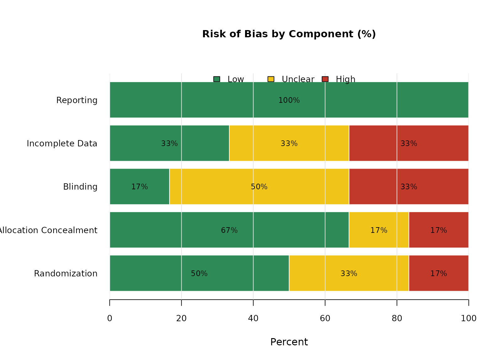
risk_of_bias_plot(
  data = rob_data,
  study = "study",
  component = "component",
  decision = "decision",
  plot = "aggregate",
  aggregate_horizontal = TRUE
)
Returned Values
The function returns useful derived objects invisibly:
names(out)
#> [1] "decision_matrix" "counts"          "percentages"
out$counts
#>                        Low Unclear High
#> Randomization            3       2    1
#> Allocation Concealment   4       1    1
#> Blinding                 1       3    2
#> Incomplete Data          2       2    2
#> Reporting                6       0    0
round(out$percentages, 1)
#>                          Low Unclear High
#> Randomization           50.0    33.3 16.7
#> Allocation Concealment  66.7    16.7 16.7
#> Blinding                16.7    50.0 33.3
#> Incomplete Data         33.3    33.3 33.3
#> Reporting              100.0     0.0  0.0